Role: Lead UI/UX Researcher & Designer
Duration: 5 weeks
Skills: Affinity mapping, UX Research, Figma high-fidelity prototyping, brand concept & development, competitive analysis
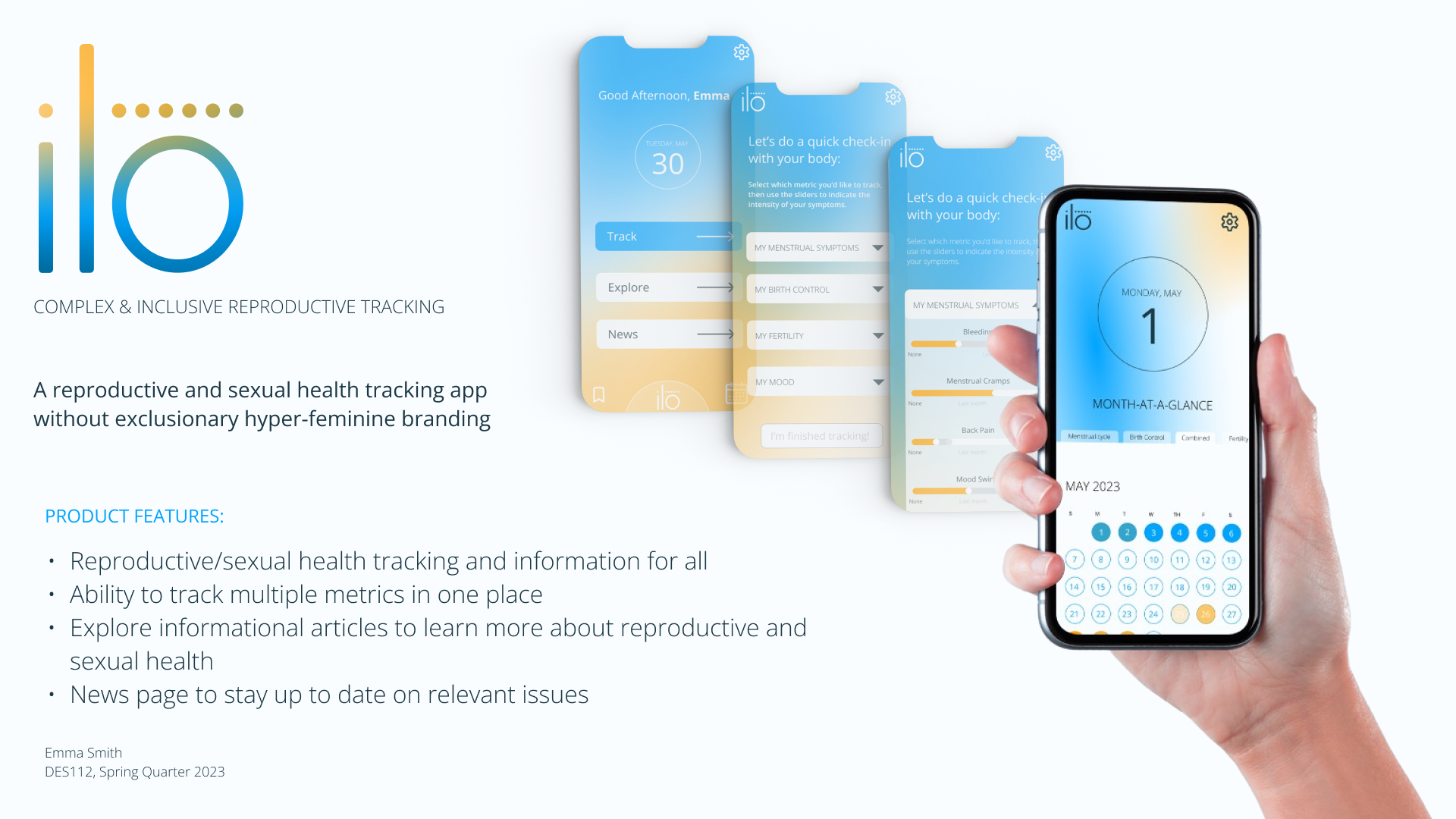
Meet ilo (pronounced "ee-low"), a mobile app that addresses the lack of adequate, comprehensive, and inclusive education on sexual and reproductive health, as well as lack of inclusivity of different genders and sexualities within the tracking app space.
PROJECT OVERVIEW:
The goal of this project was to design a mobile app and high fidelity prototype that addresses an equity issue, backed by UX research. The timeframe for this project was approximately 5 weeks from initial proposal to the final pitch. As this was an independent project, I wore multiple hats and conducted UX research, sketched wireframes, conducted user testing, created the branding for the app, as well as built the functioning prototype.
INITIAL RESEARCH:
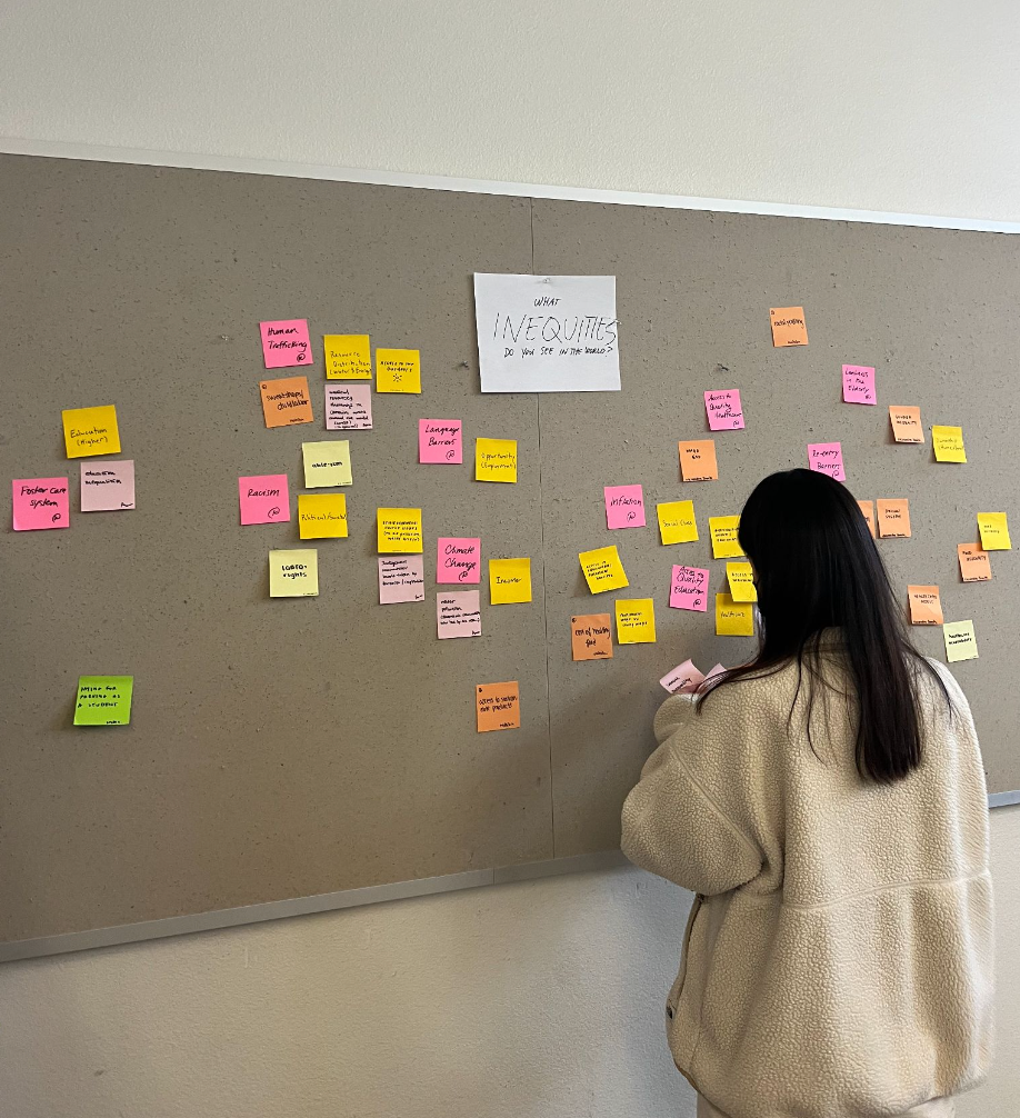
I started the initial research phase for this project by doing an affinity mapping exercise, which I collaborated with other students in order to produce a diverse range of ideas for equity issues that I could potentially tackle. Popular topics that I noticed were health, gender equality, and education, which informed my idea for creating an inclusive reproductive health app.
IN-DEPTH USER RESEARCH:
Once I identified the equity issue that I wanted to tackle in my app, I conducted user research in order to gain a better understanding of my audience's pain points with the current solutions to the equity issues related to reproductive health and tracking apps. The two main methods I used were SWOT analysis and a survey of 48 random students in the Design program at UC Davis. I also did a brief competitive analysis in order to gain a better understanding of similar apps that are already on the market and where improvements could be made.
In the SWOT analysis, I identified opportunities such as combining multiple features into one app, creating a wider audience than most other menstrual tracking apps, and utilizing a visual representation of symptoms. I also noted several threats and weaknesses, including difficulty of execution in a short timeline, the potential of the progressive nature of the app only appealing to a younger audience, and the audience being too niche.
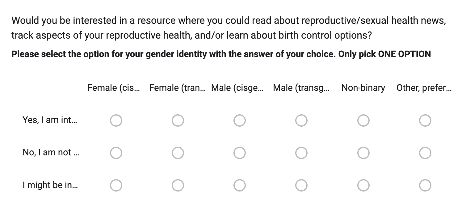
My survey was the element of research that gave me the most insights into my potential audience and goals of my project. The survey was completed by 48 respondents of all genders (questions listed on the right).
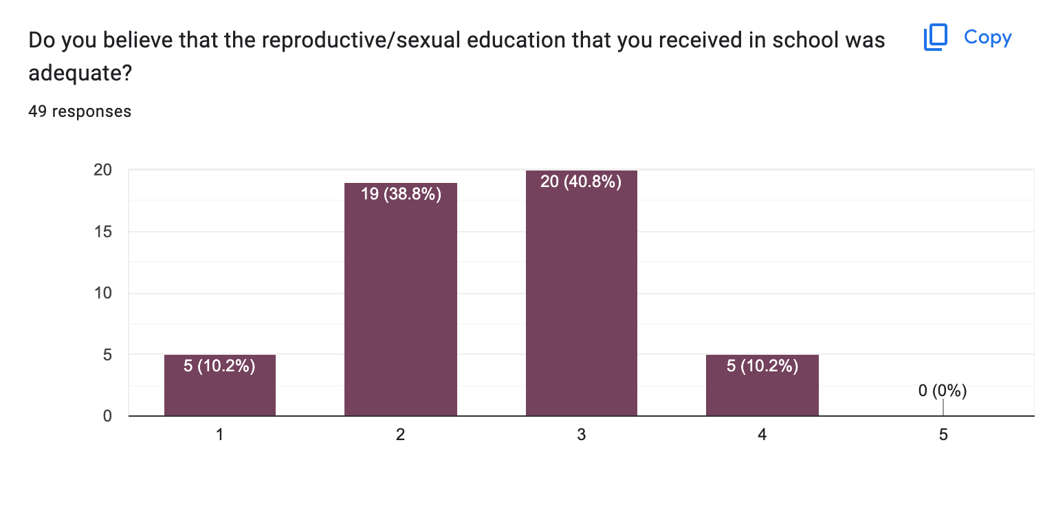
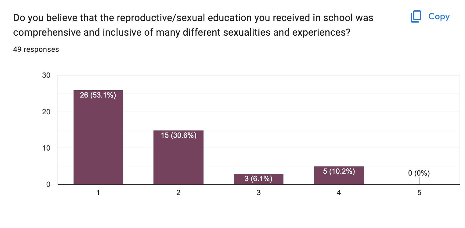
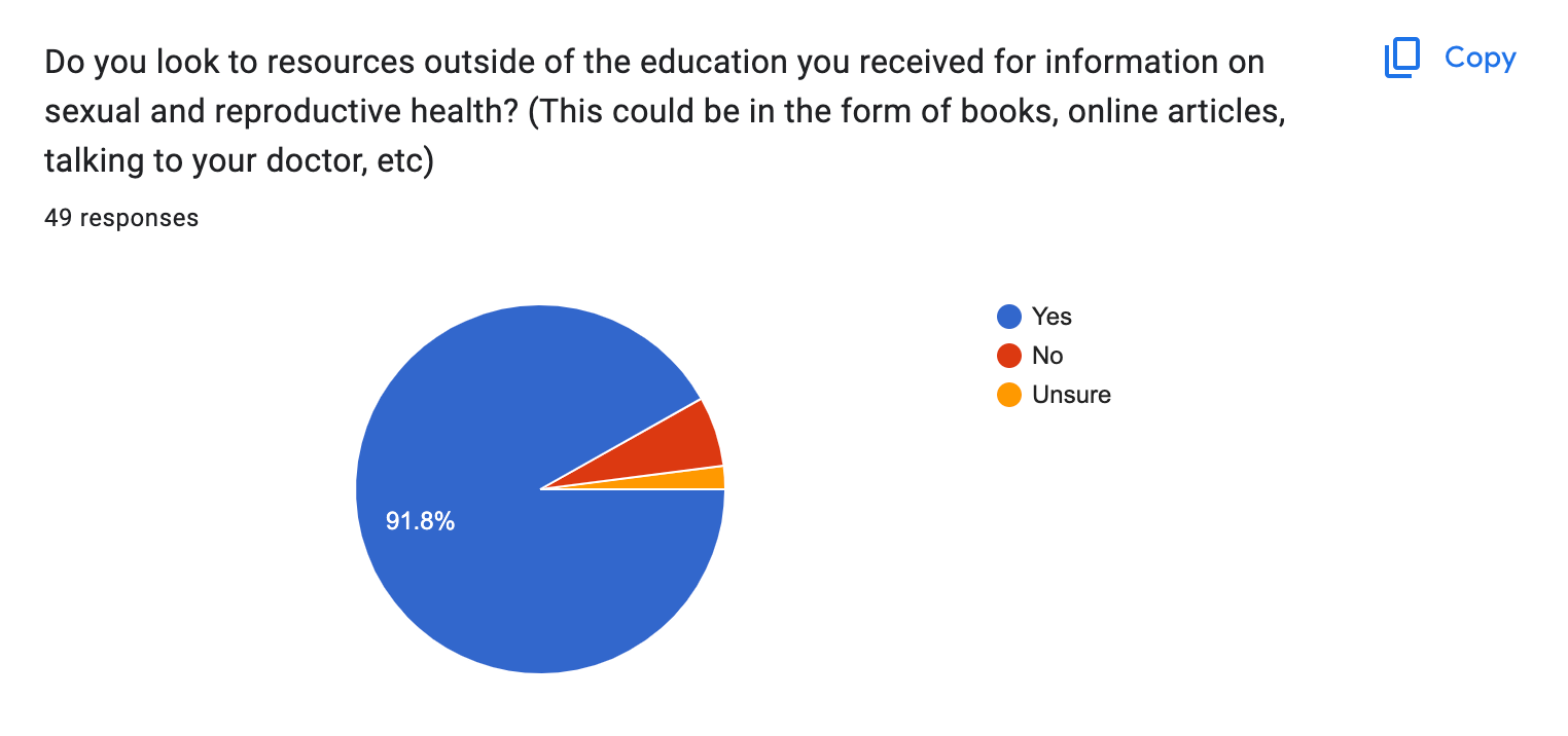
The first three questions have to do with the population’s feelings about their experience with sexual and reproductive education in school in order to get an understanding of their needs. On a scale of 1-5 of how adequate their reproductive/sex education in school was, 89.6% of respondents answerer 3 or less, and 47.9% answered less than 2. When asked how comprehensive and inclusive their sex ed was of different sexual orientations/genders on a scale of 1-5, 83.4% responded 2 or below, with 52% of them being a 1. In terms of sexual and reproductive education outside the classroom, 93.8% of respondents reported that they have looked to outside sources for information about their bodies. This is very telling, as it demonstrates that even the individuals who felt like their sexual education was adequate and comprehensive, that they still feel misinformed enough about their own bodies to look to outside resources.
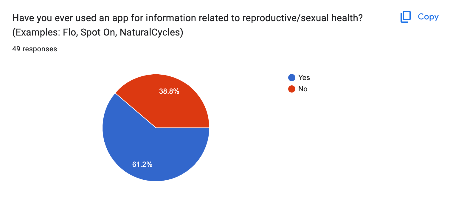
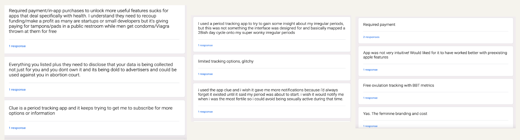
The next portion of the survey focused on existing apps in this genre and the population’s experiences and opinions on them. I was surprised to learn that 62.5% of respondents have used an app for information on reproductive/sexual health. After this question, I asked an optional, open-ended question where users could provide their opinion on problems with existing apps. I asked this to inform my design by identifying pain points within existing apps. The most common issues that respondents mentioned were: cost, feminine branding, lack of intuitive design, and limited tracking options. Multiple respondents also noted how they wish that there was an app that they could use to track multiple metrics but not all of them. Including this open-ended question was helpful because it told me more specifically what pain points were coming up for users and specific aspects that I can focus on in my app design.
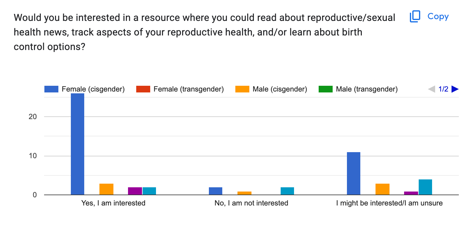
Finally, I created a question with a multiple choice matrix, where users could self-identify their gender identity and whether or not they are interested in an app that they could read about reproductive/sexual health news, track aspects of your reproductive health, and/or learn about birth control options. I included this question because I wanted to gauge interest among respondents to see if people outside the cisgender female audience would be open to using my app. I also included cisgender and transgender males, to see if I should broaden my audience to include men, as well. The response to the question about how interested respondents would be in an app like the one I am designing was overwhelmingly positive, with the majority of people answering yes or maybe. I was surprised at the number of cisgender males that answered yes or maybe was higher than those who answered no. Overall, my survey data confirmed my observations related to my own experience with sex ed, reproductive health apps, and the lack of representation in both. The survey identified pain points that I may not have otherwise thought of, and affirms the need for an app like this on the market.
LOW-FIDELITY PROTOTYPES & USABILITY TESTING:
Once I identified some pain points in the survey, as well as features that my target audience desired, I created a list of 5 tasks that I wanted the user to be able to perform within the app:
1. Create an account/ Onboarding
2. Track menstrual cycle and symptoms
3. Track their methods of birth control
4. View their tracking metrics for different days using a monthly calendar view
5. Add metrics that they would like to track
6. Navigate through relevant educational and news articles related to the topics of sexual, menstrual, and reproductive health (bonus)
Once I identified these main tasks, I created a low-fidelity physical prototype on paper, in which I drew out a flow for each task on a series of 'phone screens'. Next, carried out my initial usability testing, where I tested my flows on 5 users. In general, users were able to navigate seamlessly on the paper prototype, and the only major pain points were button spacing and text size on the paper model. While the paper prototype was not fully functional, it still provided basic insights in terms of the users' thought processes when carrying out simple tasks.
After the initial usability testing on the paper prototype, I moved two of the flows into Figma and created a digital low-fidelity prototype and carried out the same usability testing with new users.
TASK DESCRIPTION:
I had users try out the Create Profile task, as well as the Track Menstrual Symptoms task. For creating a profile, users need to enter some basic personal information, select topics that interest them related to reproductive health, and select which metrics they are trying to track in the app. For tracking menstrual symptoms, users must select the ‘Track’ button on the home screen, navigate to the dropdown menu where they select ‘Menstrual Symptoms’, then utilize the slider feature to indicate their intensity of symptoms for that day. When finished, they will navigate to the calendar to see how their symptoms have ebbed and flowed over time. I performed a usability test with 5 users, 4 of which being DES112 classmates, and the other being my housemate who has experience using other menstrual tracking apps.
RESULTS AND SUMMARY:
Overall, users were able to navigate the Create Profile task fairly seamlessly. One pain point that three of the users brought up was the arrow to move onto the next step was somewhat unconventional and that they would prefer a button because it is more intuitive. I believe this is related to the idea of affordance and that a button has greater affordance than a simple arrow. Another pain point that two of the users brought up was the size of the text and type boxes. Both users thought that the type boxes were too small and therefore confusing. Something challenging about having users complete a signup task using information that isn’t their own is that sometimes they would press different buttons than intended (ex. Their pronouns rather than the hypothetical pronouns of the person signing up). Users were satisfied with the slider bars to indicate severity of symptoms, which I think was because the slider bars was a new feature than the other buttons and dropdowns, causing users to feel surprise and delight. Users were also pleased with the calendar feature and the ability to press on specific dates and see the different metrics.
FEEDBACK AND AREAS TO IMPROVE:
Since I only had two tasks for users to perform, one issue I ran into was when the users pressed buttons for features I hadn’t added yet. I believe this will be more clear once I the high-fidelity prototype is completed. The confusion with the arrows in the signup task led me to switch them out for buttons to create that sense of affordance. In the high-fidelity prototype, I also implemented a ‘back’ arrow in this step, too, since a couple of my users brought up wanting to go back. I also planned to develop the calendar page more fully in the high-fidelity prototype, since in the early usability testing, it was not built out fully and some users were wanting to click around and explore but it wasn’t responding. Overall, my usability testing was extremely valuable, as it helped my identify areas where my app could be more intuitive for users.
Since I only had two tasks for users to perform, one issue I ran into was when the users pressed buttons for features I hadn’t added yet. I believe this will be more clear once I the high-fidelity prototype is completed. The confusion with the arrows in the signup task led me to switch them out for buttons to create that sense of affordance. In the high-fidelity prototype, I also implemented a ‘back’ arrow in this step, too, since a couple of my users brought up wanting to go back. I also planned to develop the calendar page more fully in the high-fidelity prototype, since in the early usability testing, it was not built out fully and some users were wanting to click around and explore but it wasn’t responding. Overall, my usability testing was extremely valuable, as it helped my identify areas where my app could be more intuitive for users.
DESIGN SYSTEM:
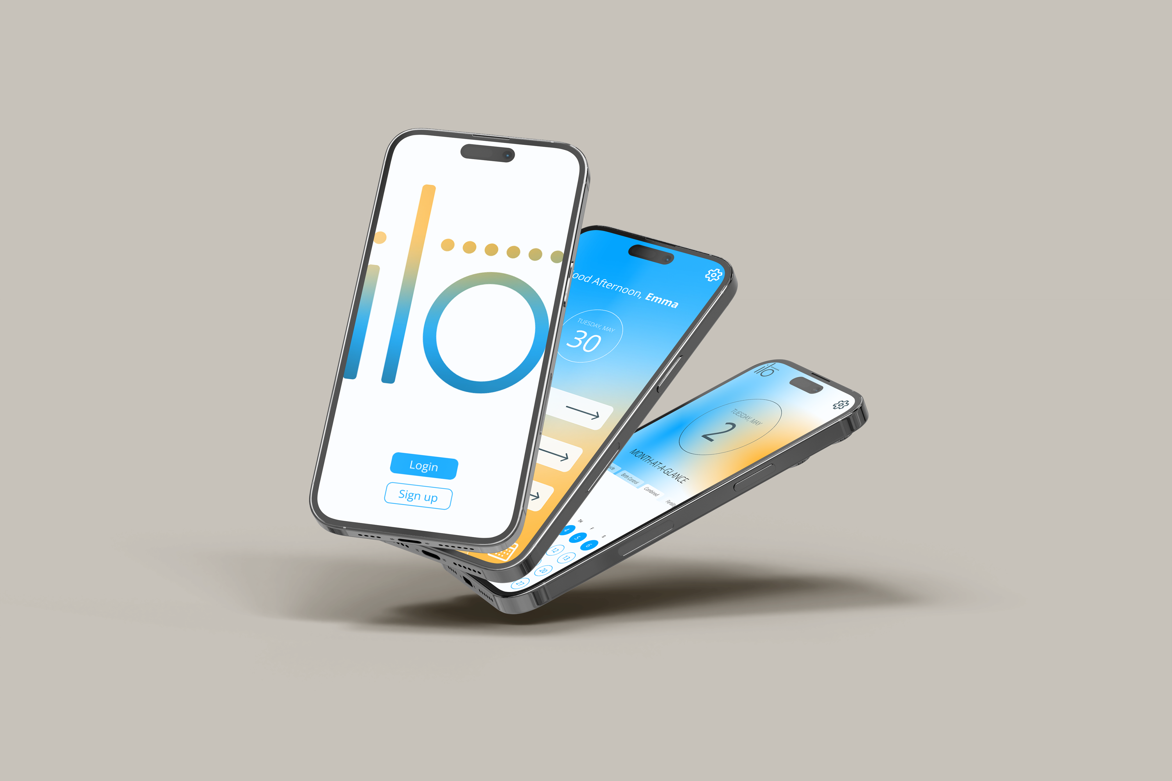
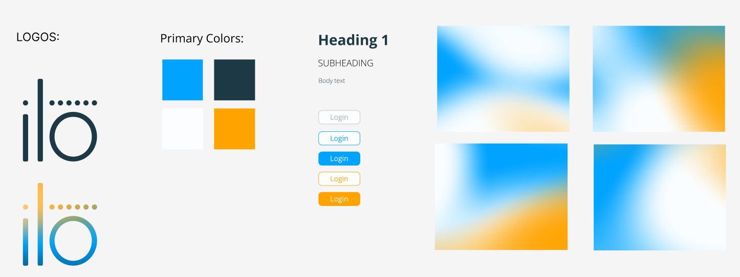
In the survey, users indicated common pain point with current menstrual tracking apps is the overly feminine branding, which can cause users who may not identify with that branding to feel uncomfortable. Additionally, these hyper-feminine menstrual and reproductive tracking apps are not inclusive of transgender individuals who may get a period, as well as cisgender females who may just not resonate with traditionally feminine motifs. To combat these sentiments in my app, I leaned into a more gender-neutral color palette and imagery to make the app more appealing to a wider range of individuals.
The app's name, ilo, comes from the latin word referring to a tool, as well as a common gender-neutral name in Finland. The prevalent imagery throughout the app is circles - the logotype has seven circles to represent the 7 days of the week, and circles are used throughout the app to designate areas where users can record their symptoms on different days of the month.
Overall, I wanted the app to have a fresh and modern feel, which I accomplished using a clean logo design, simple shapes, and bright contrasting colors. The gradient detail is a nod to the gradient trend that is taking Gen Z by storm, as well as to visually represent the significance and combination of symptoms on a given day. This visual representation of the combination of symptoms is a feature that sets this app apart from all existing tracking apps on the market currently.
HIGH-FIDELITY PROTOTYPE:
After conducting user testing with the low-fidelity prototype, I incorporated changes, as well as the branding, into the high-fidelity prototype in Figma. This was the first functioning prototype that I created in Figma, so it was a steep learning curve that I managed to overcome in just five weeks.
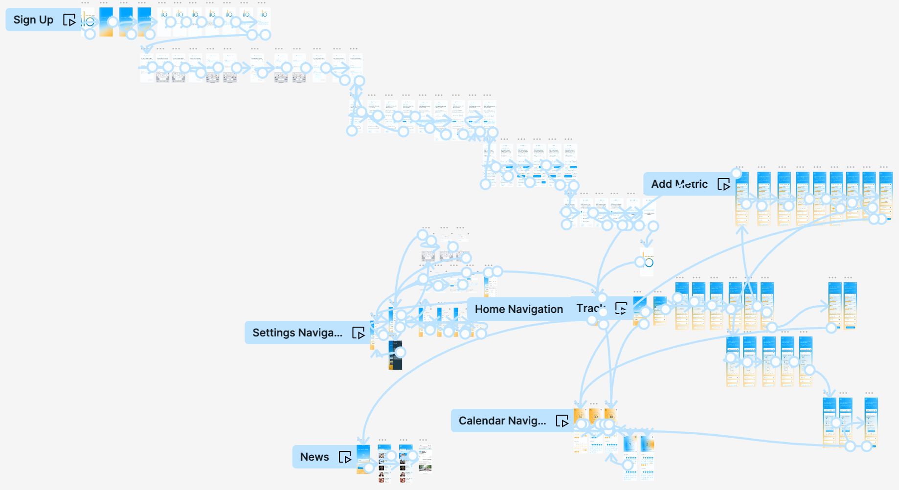
Overview of high-fidelity prototype task flows
Task flow walk-though: Signing up/ onboarding