Role: Freelance Designer
Duration: 1 month
Skills: Branding, Logo Design

PROJECT SUMMARY:
D&D Learning Spaces is a small business based in Concord, CA that works with school districts across California to update and modernize K-12 classrooms to better facilitate learning in the 21st century. When D&D was created, it was focused on classroom and technology security, but in recent years, the company has pivoted to focus more on flexible furniture, technology, and interior design for classrooms. I was hired as a contract designer to work with D&D's Graphic Designer, Cathy Forbes, to reimagine their branding to better reflect their current work after over 50 years in business. The deliverables I created were a new logo, mockups for company t-shirts, as well as a graphic standard.
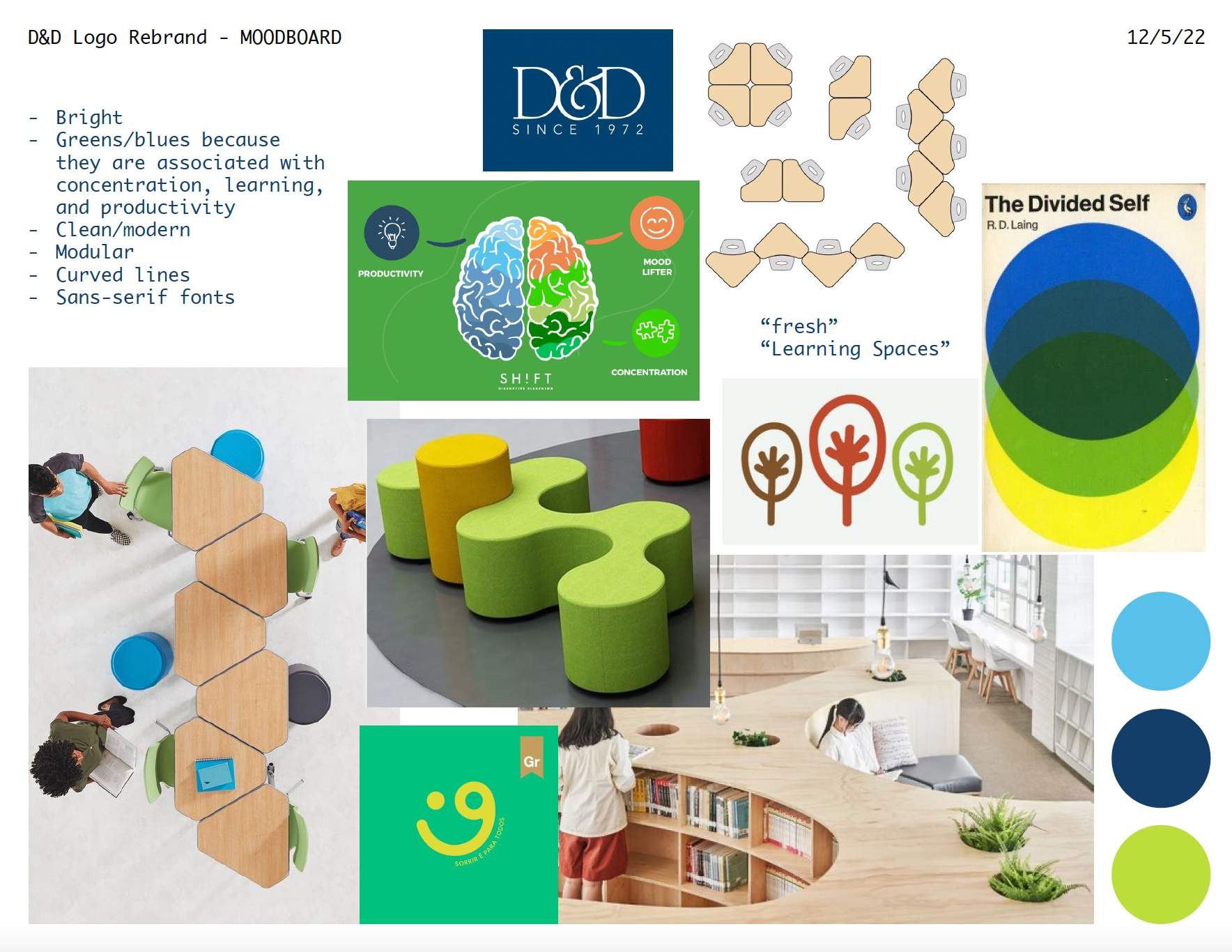
MOOD BOARD:
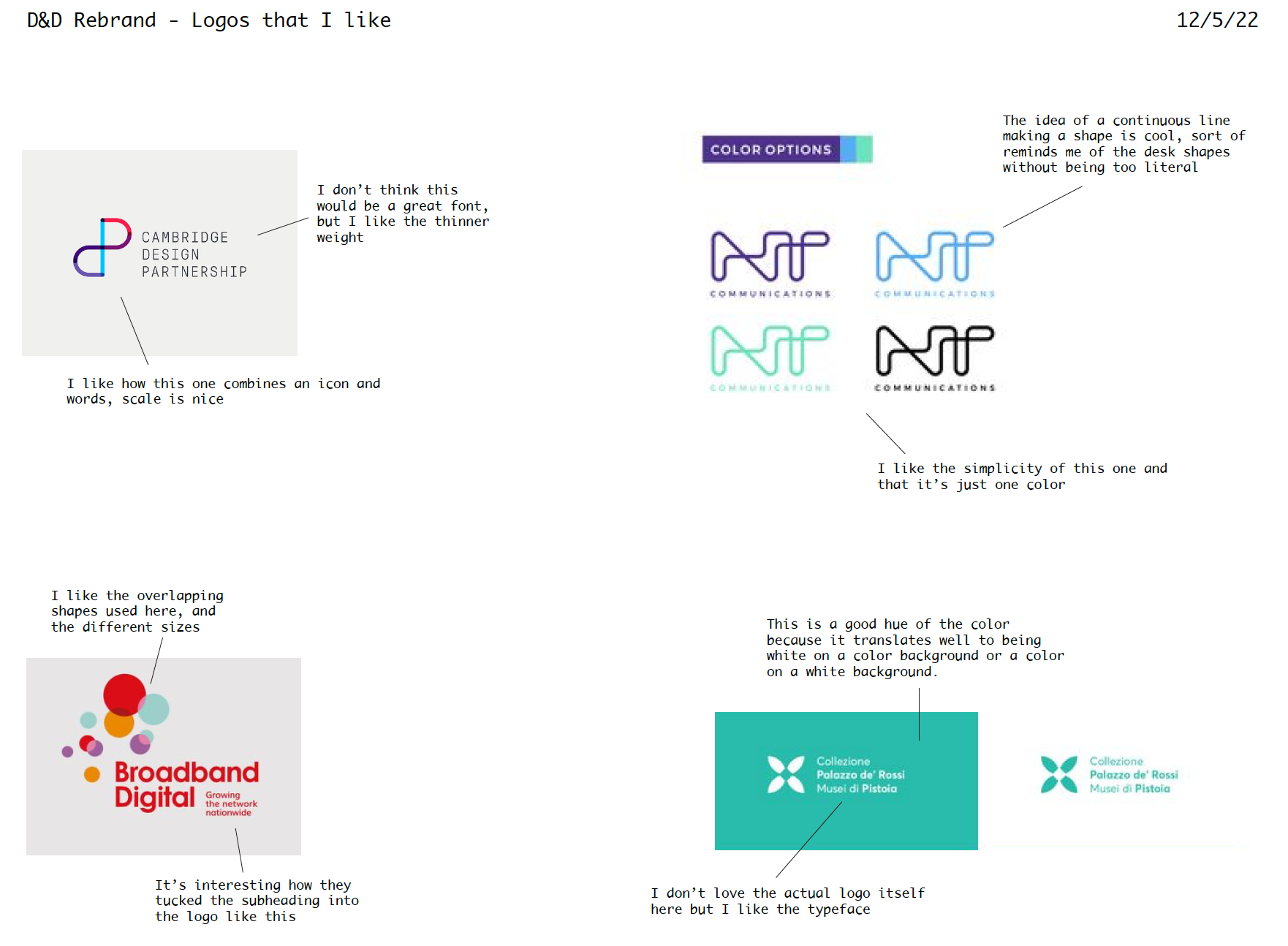
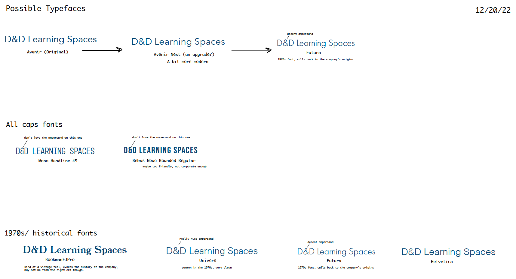
After meeting with D&D's CEO, President, and Graphic Designer to discuss their visions for the new rebrand, I created a mood board to ground my designs. During our meeting, I wrote down words that were used to describe the company, as well as words that they wanted the rebrand to evoke. I also included photos from D&D's project archives, as well as colors pulled from those photos. Finally, I also included some examples of graphic design in the 1970s to harken back to D&D's founding in 1972. I also created a separate page with examples of logos that I liked and thought could work well in showcasing D&D's new vision. Once I created these documents, I discussed them with the board, who approved them for moving on to create the new logo.
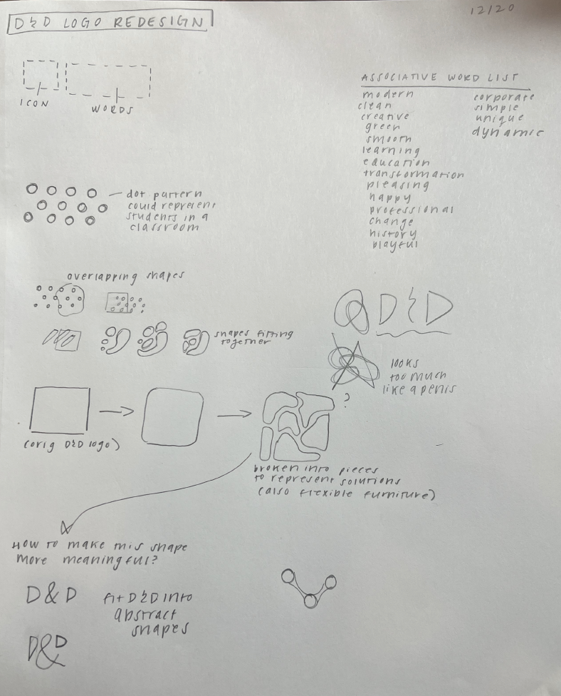
ITERATIONS:
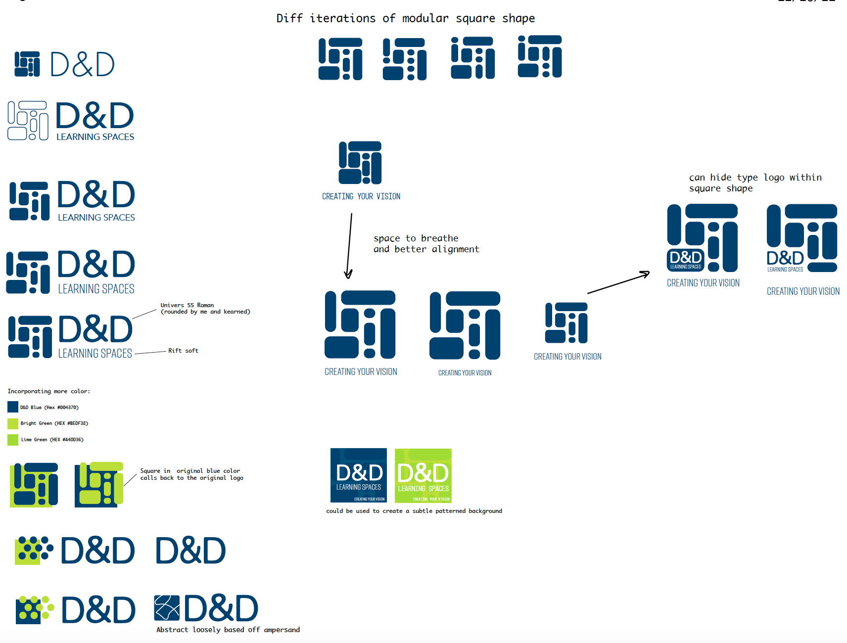
I worked closely with Cathy Forbes in order to choose the final typeface and iconography. The team preferred the square icon made of several smaller modules, so I iterated off of that design to create the final logotype. Below are several examples of iterations I went through before selecting the final design. (Click on individual photos to enlarge them)!
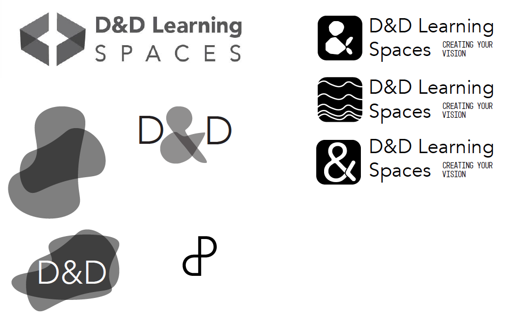

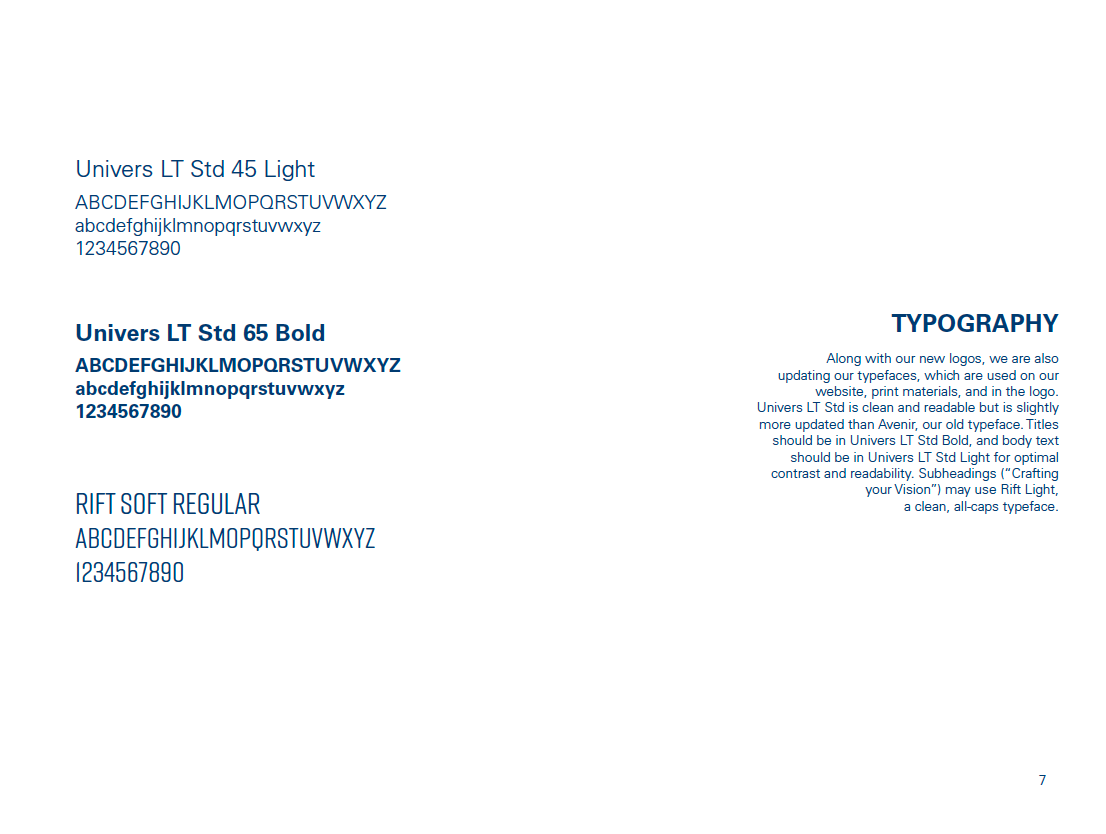
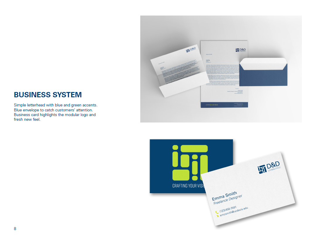
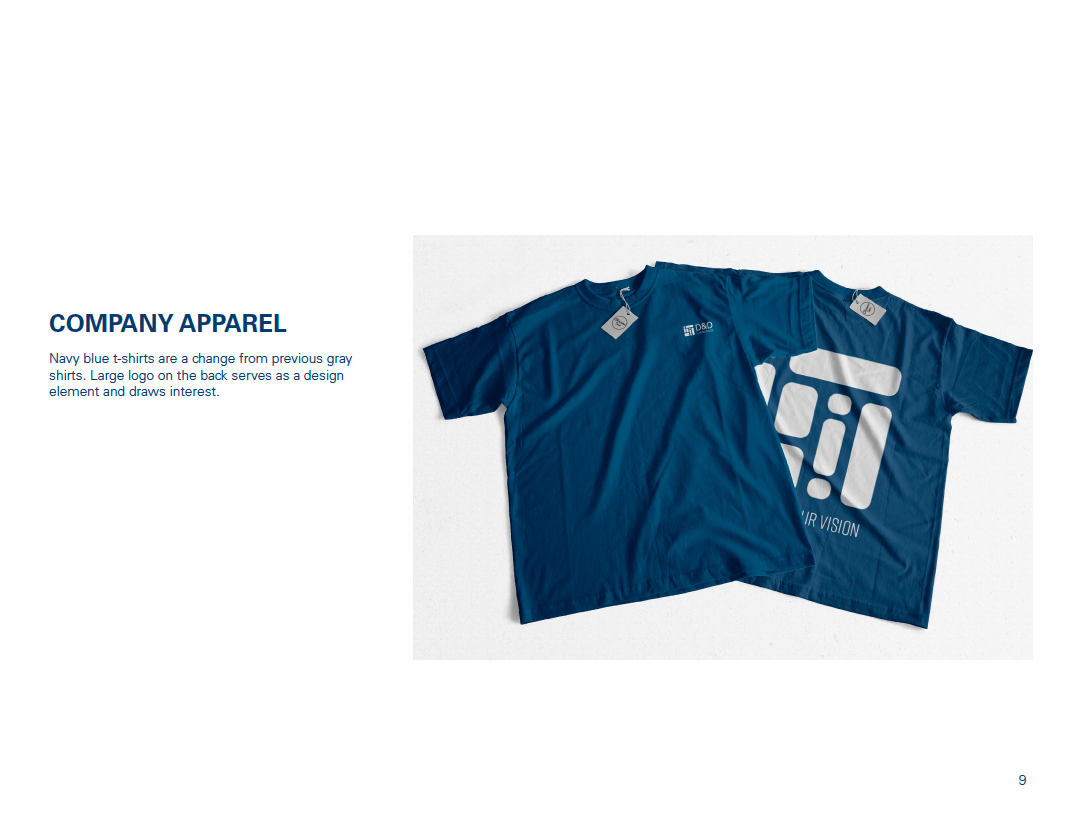
FINAL LOGO and GRAPHIC STANDARD:
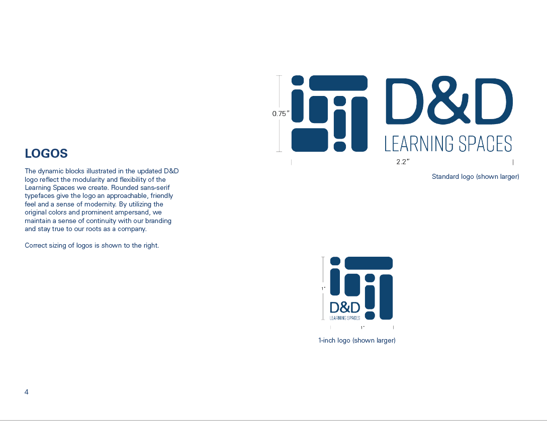
For the final logo, I ended up using a version of the modular square, as well as modifying an existing typeface to better match the icon. The modules are representative of the flexible classroom furniture that D&D specializes in that is able to be rearranged in infinite different ways. I kept D&D's signature navy blue as the primary color, but incorporated a bright lime green to add contrast and modernize the branding. Green is also associated with growth and learning, which were both words that the team want the business to reflect.
Below is my final deliverable that I created for the D&D team after we agreed on the final logo and colors. I created the graphic standard as an extension of their current visual guidelines to instruct future designers for their company on how to use the new visual standards.